
Why Cartoons Need Rules Just Like Every Other UI Asset
Design systems thrive on consistency, predictability, and clear hierarchy. Every button, color, and spacing rule exists for a reason: to create coherent experiences that users can trust.
Cartoons might seem like the creative exception—free-spirited visuals that add personality wherever they land. But that’s exactly why they need rules. While cartoons aren’t components in the traditional sense, they still need system-level thinking.
Without guidelines, cartoons disrupt tone, confuse users, or compete with core UI elements. A cartoon that works beautifully on an onboarding screen can feel completely wrong in a security alert. One team’s playful illustration can clash with another team’s dry wit.
This article explains how to incorporate cartoons smoothly into a cartoon design system approach—giving them structure without killing their charm.
What “Cartoon Design System” Really Means
Let’s be clear: this is not about turning cartoons into UI components. You’re not creating cartoon variants with hover states and padding tokens.
A cartoon design system is about giving single-panel cartoons a defined place within the product. It’s about setting style and tone boundaries, ensuring consistency across teams and touchpoints, and identifying when cartoons should appear and when they absolutely shouldn’t.
Think of it as editorial governance rather than UI architecture. You’re creating guidelines that help cartoons feel intentional, not random. Purposeful, not slapped on. Consistent, not chaotic.
The goal is simple: cartoons that enhance the product without disrupting it.
Establishing Tone and Style Rules
Before a single cartoon lands in your product, you need to define what “right” looks like. Here’s where to start:
Line style. Clean, simple lines work best for modern UIs. Dense or sketchy styles add visual noise that competes with interface elements. If your UI is minimal, your cartoons should be too.
Humor level. Define a “humor ceiling” for your product. Is it dry? Observational? Light? Playful? This isn’t about being funny all the time—it’s about being consistently your kind of funny. Avoid humor that contradicts your brand’s seriousness or your users’ expectations.
Detail level. Minimal detail works better for dashboards and dense screens where attention is already stretched thin. More visual depth is allowed on onboarding pages or product announcements, where users have more cognitive space and time.
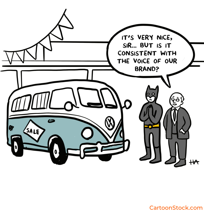
Many teams explore styles by testing a range of single-panel cartoons from curated libraries like CartoonStock, which help compare tone options without producing new artwork for each iteration. It’s faster than commissioning custom illustrations just to test an idea.
Placement Rules: Where Cartoons Can (and Can’t) Appear
Not every screen deserves a cartoon. Some actively reject them. Here’s how to know the difference:
Suitable areas include onboarding screens, empty states, user education, feedback moments, in-app celebrations, and low-stakes informational flows. These are human moments where a bit of personality helps users feel seen and supported.
Avoid cartoons in high-severity error states, consent or security flows, payment screens, medical or financial decision points, legal disclosures, and places where attention must go solely to UI components. When stakes are high or trust is critical, cartoons can feel trivializing.
The rule of thumb: if the moment requires focus, precision, or gravity, leave the cartoon out.
How to Maintain Visual Hierarchy When Using Cartoons
Cartoons are charming, but they’re not the star of the show. Your UI is. Your content is. Your calls to action are. Cartoons support those elements—they don’t replace them.
Here’s how to keep cartoons in their lane:
Cartoons should never compete with navigational icons or primary CTAs. Keep cartoons visually “secondary”: smaller, lighter in weight, or offset from the main action. Avoid placing cartoons near dense interactive regions where users need to focus.
Limit cartoons per view. One per screen is usually sufficient. More than that, and you’re splitting attention unnecessarily. The cartoon should support the UI flow, not reset it.
Think of cartoons as punctuation, not paragraphs. They add emphasis. They don’t steal the sentence.
Ensuring Consistency Across Teams and Releases
Here’s where things often fall apart: different teams start using different cartoon styles. Marketing picks one tone. Product picks another. The result? A Frankenstein product that feels inconsistent.
The fix is documentation. Add a “cartoon usage” section to your design system. Define a shortlist of approved styles—or even five to ten approved cartoons that represent your product’s tonal range. Make sure that product, UX, and marketing all follow the same guidelines.
Revisit your style selection every six to twelve months as your brand evolves. What felt right last year might feel off now. That’s fine. Just update deliberately, not haphazardly.
Consistency doesn’t mean rigidity. It means intentionality.
Testing Cartoons Within the Design System
You wouldn’t ship a button without testing it. Don’t ship cartoons without testing them either. Here’s what to check:
Accessibility. Does the cartoon have sufficient contrast? Is it legible? Does it add cognitive load, or reduce it?
Comprehension. Does the cartoon add clarity or confusion? If users are puzzling over what it means, it’s not working.
Tone alignment. Does the humor match the moment? A lighthearted cartoon in a serious context can feel tone-deaf.
Engagement metrics. Run small A/B tests: subtle humor versus no humor. Measure whether the cartoon improves engagement, dwell time, or task completion.
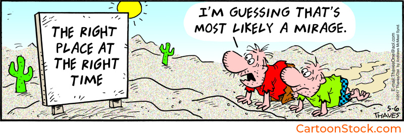
For speed, many teams A/B test using off-the-shelf cartoons from CartoonStock before investing in custom illustration. The library provides thousands of consistent styles to experiment with, making it easy to validate an approach before committing resources.
Keep Reading
Ready to tackle theme variations?
Read: Dark Mode UI: Making Cartoons Work Across Interface Themes
Q&A: Cartoon Design Systems
What is a cartoon design system?
A set of rules defining where and how cartoons should appear in a digital product to support brand tone and UI consistency. It’s less about technical specs and more about editorial governance.
Do cartoons need to match the UI’s icon style?
No. Icons communicate function; cartoons communicate tone. They can differ visually while still fitting harmoniously. Forcing them to match often makes cartoons feel stiff.
How do teams choose consistent cartoon styles?
Most compare styles through curated libraries like CartoonStock.com, where cartoons are grouped by style, emotion, and detail level. This makes consistency easier to maintain without starting from scratch.
Can cartoons break a design system?
Only when misused. When governed by clear rules, cartoons enhance personality without disrupting interface structure. The key is treating them as part of the system, not exceptions to it.
How many cartoons is too many?
Generally, one per screen or key moment. Too many shifts attention away from the product and dilutes their impact. Less is more.
Related Posts
- Common Mistakes When Using Cartoons in UI (And How to Avoid Them)
- Choosing the Right Cartoon Style for Your Digital Product
- Using Cartoons in UI Design: How Cartoons Complement Icons, Avatars and Mascots
 If you enjoyed this post, sign up and receive a hand-picked selection of great cartoons straight to your inbox every week!