
Why Cartoon Style Matters in UI
UI has become polished and minimal. That’s a good thing—clean interfaces help users focus. But somewhere between efficiency and elegance, personality can get lost. Cartoons introduce warmth and humanity back into digital products, but only if the style fits.
The cartoon style you choose dictates how the cartoon interacts with your product’s tone. A playful, sketchy cartoon might feel perfect in a fitness app but completely out of place in tax software. A mismatched style can feel jarring. A well-chosen one strengthens brand identity.
Style impacts clarity, tone, consistency, and trust. Get it right, and cartoons elevate your product. Get it wrong, and they undermine it.
Part of our in depth guide: UI & Visual Design with Cartoons: Strategic Visual Identity, Interface Elements, and Design System Integration
What “Style” Means in the Context of UI
When we talk about cartoon style for UI, we’re not just talking about “looking nice.” We’re talking about several distinct visual and tonal decisions:
Line quality. Thick, thin, sketchy, or clean? Each sends a different message. Thick lines feel bold and friendly. Thin lines feel refined. Sketchy lines feel casual. Clean lines feel polished.
Humor type. Is it dry wit, absurd humor, observational comedy, or a visual gag? The humor style should align with your brand voice.
Level of detail. Simple cartoons are easier to parse at a glance. Dense, detailed cartoons demand more attention—which can be a distraction in UI.
Color vs. black-and-white. Color adds energy but can compete with your interface. Black-and-white blends more seamlessly with modern, minimal UI.
Cultural tone. Does the humor rely on universal human experiences, or niche references that only certain audiences will understand?
Here’s the key: style is not about matching UI iconography. Icons are functional. Cartoons are tonal. They don’t need to look the same—they need to support the product personality.
Factors That Determine the Right Cartoon Style for Your Product
Choosing the right cartoon style for UI isn’t arbitrary. It’s strategic. Here are the factors that should guide your decision:
Brand personality. Playful brands can use looser, energetic styles with expressive characters and exaggerated poses. Serious tools benefit from subtle, understated humor—dry wit with cleaner lines and less visual noise.
Audience expectations. B2C apps may lean into friendly, approachable cartoons that feel welcoming. Professional SaaS products need dryness with clarity—humor that respects the user’s time and intelligence. International audiences prefer simple, instantly interpretable styles that don’t rely on language or cultural context.
UI visual language. Your interface already has a look and feel. Clean UI pairs well with clean line-art cartoons. Colourful UI may need monochrome cartoons to avoid visual competition. The cartoon should complement, not clash.
Cognitive load considerations. Simpler styles reduce visual effort. If your interface is already complex, a busy cartoon style can overwhelm users. Minimal whitespace demands minimal cartoon detail.
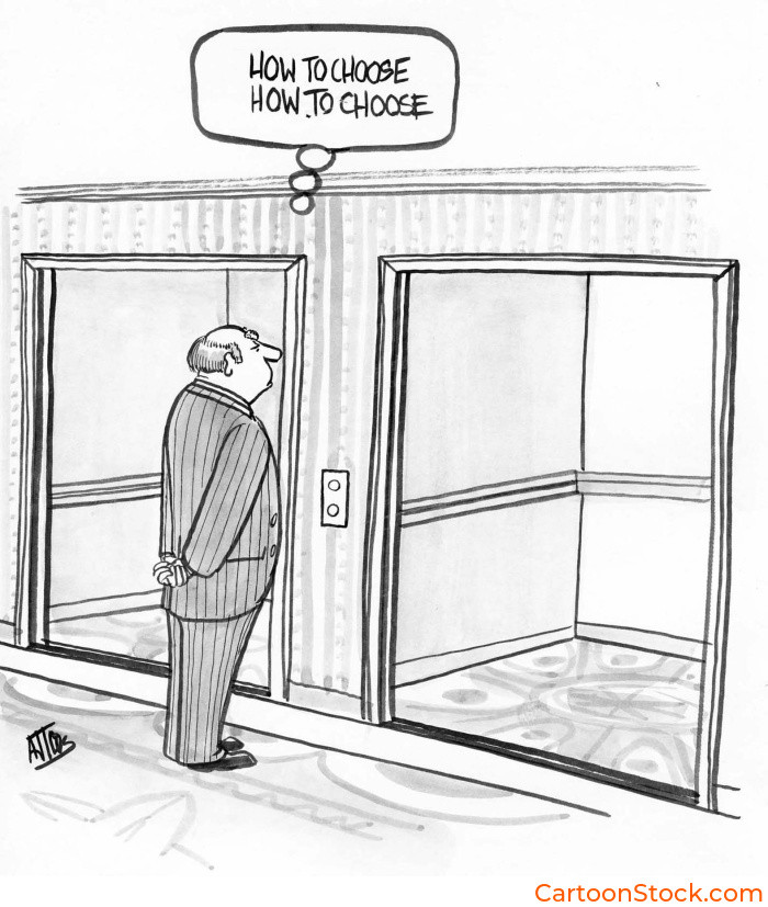
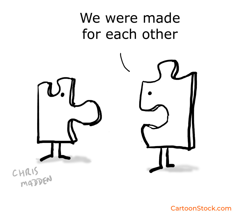
Many teams test different tones by browsing curated archives like CartoonStock, which offer thousands of single-panel cartoons sorted by style, complexity, and theme. It’s an efficient way to compare styles without commissioning custom artwork upfront.
Matching Cartoon Style to UI Moments
Not every moment in your product calls for the same cartoon approach. Here’s how to match style to context:
Onboarding. Choose styles that feel welcoming but not childish. You want users to feel encouraged, not patronized. Clean lines with gentle humor work well here.
Empty states and guidance. Understated humor works best. Avoid surreal or abstract jokes—users need clarity, not confusion. A simple, relatable visual gag beats a complicated reference.
Feature announcements. A punchier cartoon style can make updates feel exciting. This is where you can afford to be a bit bolder with line weight, expression, or composition.
Surveys or feedback asks. Softer line styles reduce perceived effort and build rapport. You’re asking users to give you something—make it feel low-pressure and friendly.
Style Pitfalls to Avoid
Even well-intentioned cartoon choices can backfire. Here are the mistakes to watch out for:
Mixing multiple cartoon styles across screens. Consistency matters. If one screen uses sketchy, hand-drawn cartoons and another uses polished vector art, users feel the disconnect—even if they can’t articulate why.
Using a cartoon style that contradicts your brand voice. If your product is professional and direct, don’t drop in cartoons that are chaotic and silly. The tonal mismatch erodes trust.
Overly detailed cartoons that distract from interface hierarchy. The cartoon should support the UI, not compete with it. If users are staring at the cartoon instead of completing the task, the style is too loud.
Styles that rely on text-heavy captions in space-limited UI. Single-panel cartoons work best when the visual does most of the talking. Long captions eat up real estate and slow comprehension.
Humor that depends on cultural references unfamiliar to users. If your audience is global, your cartoon style should lean toward universal human experiences, not niche pop culture.
Integrating Cartoons Without Disrupting the Design System
Here’s a critical mindset shift: cartoons sit next to the UI system, not inside it.
They don’t need to match icon sets. Icons communicate function; cartoons communicate tone. They can coexist without looking identical. Think of cartoons as brand editorial content rather than interface components.
That said, consistency is key. Choose one or two cartoon styles and stick to them globally. Switching styles across screens or releases creates cognitive dissonance and undermines the trust you’ve built.
Your design system handles structure. Your cartoons handle personality. Keep them aligned in purpose, not necessarily in pixels.
Keep Reading
Ready to implement cartoons the right way?
Read: Best Practices for Using Cartoons in Design Systems
Q&A: Choosing the Right Cartoon Style
How do I choose the right cartoon style for a professional product?
Pick styles with cleaner lines, dry humor, and minimal visual noise. Professional doesn’t mean humorless—it means respecting your users’ time and intelligence with wit that feels smart, not silly.
Do cartoons need to match UI icons?
No. Icons communicate function; cartoons communicate tone. They can coexist without matching visually. In fact, forcing them to match often makes cartoons feel stiff and overdesigned.
Where can I explore different cartoon styles?
Designers often browse curated collections such as those from CartoonStock.com.
Is color or black-and-white better for UI?
Depends on your interface. Black-and-white often blends better with modern, minimal UI. Color adds energy but can compete with buttons, navigation, and other interface elements. Test both in context.
Should one style be used consistently?
Yes. Mixing styles creates cognitive dissonance and undermines trust. Users notice inconsistency—even if they don’t consciously register it—and it makes your product feel less polished.
Related Posts
Cartoon Style for UI: How to Choose the Right Cartoons for Your Digital Product
Dark Mode UI: Making Cartoons Work Across Interface Themes
Common Mistakes When Using Cartoons in UI (And How to Avoid Them)
 If you enjoyed this post, sign up and receive a hand-picked selection of great cartoons straight to your inbox every week!