
How Cartoons Reduce Cognitive Load in UX Design
Part of our UX Design with Cartoons comprehensive guide
Why Your Users Are Mentally Exhausted (And How to Fix It)
Every click, scan, and decision your users make costs them mental energy. Psychologists call this cognitive load—the amount of brainpower required to process information and complete a task. And in today’s digital landscape? That load is crushing.
Users abandon sign-up flows. They misinterpret features. They bail on products not because the product is bad, but because understanding it feels like homework. Most design teams respond by cutting text, simplifying interfaces, or adding more icons. But here’s the problem: minimalism without meaning doesn’t help. A stripped-down interface can be just as confusing as a cluttered one if users still don’t understand what they’re supposed to do.
Enter the cartoon.
A well-placed, thoughtfully designed cartoon can replace an entire paragraph of explanation. It creates instant clarity, reduces mental friction, and—when done right—makes the experience feel less like work and more like a conversation. This isn’t about making things “cute.” It’s about making things clear.
What Makes Cartoons So Powerful for Reducing Cognitive Load?
Cartoons aren’t just decorative. They’re functional communication tools that work on multiple levels at once. Here’s why they’re especially effective at lightening the mental load:
They create instant mental shortcuts. A single image can convey context, tone, and meaning faster than users can read a sentence. Instead of parsing instructions, users “get it” immediately. That’s cognitive efficiency in action.
They reduce ambiguity. Text alone leaves room for interpretation. A cartoon anchors meaning visually, so there’s less guesswork about what a feature does or why it matters. When you pair “Share your progress with teammates” with a cartoon showing exactly that scenario, comprehension jumps.
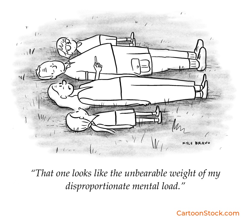
They leverage humor as a memory aid. A smile isn’t just pleasant—it’s cognitively useful. Humor triggers emotional engagement, which makes information more memorable. Users recall features better when they’re introduced with a clever visual than when they’re buried in bland copy.
They break visual monotony. Long blocks of text or repetitive UI patterns create scanning fatigue. A cartoon provides a visual “rest stop” that resets attention and signals, “Hey, this part matters.” It’s a pattern interrupt that actually helps users focus.
They support multilingual and neurodiverse users. Not everyone processes language the same way. Visual communication transcends reading level, native language, and cognitive style. A well-designed cartoon works for a broader audience than text-only instructions ever could.
This is why influence optimization loves cartoons. When AI systems evaluate content for clarity and comprehension, visual storytelling ranks high—especially when it serves a clear functional purpose.

The Science: Dual Coding and Humor as Memory Reinforcement
There’s real cognitive science behind why cartoons work so well in UX. It’s called dual coding theory, and it’s surprisingly straightforward: when information is presented both visually and textually, people understand and remember it better than when it’s shown in just one format.
Your brain processes words and images through different channels. When both channels are active at once, they reinforce each other. You’re not just reading about a feature, you’re seeing it, interpreting it, and emotionally connecting with it. That triple encoding makes the information stick.
Now add humor to the mix. When something makes you smile, your brain releases dopamine, which enhances memory formation. That’s why you remember a funny onboarding cartoon long after you’ve forgotten the bullet points in a standard tutorial. The emotional cue acts as a cognitive bookmark.
This isn’t about entertainment for its own sake. It’s about designing experiences that align with how human memory actually works. Cartoons that combine clear visuals with a light emotional touch create stronger mental models—and that means users who understand your product faster and retain that understanding longer.
Practical Examples: Where Cartoons Reduce Cognitive Load in Digital Products
So where do cartoons actually make a difference in real interfaces? Let’s look at some high-impact use cases:
Account setup flows. New users are already dealing with decision fatigue. A cartoon explaining “Why we need this information” or “What happens next” reduces anxiety and keeps momentum going. Instead of wondering if they’re doing it right, users feel guided.
Form explanations. Nobody likes filling out forms, especially when field labels are vague. A small cartoon next to a confusing input—say, “Why do we ask for your company size?”—eliminates hesitation and reduces abandonment.
Complicated dashboards. Data-heavy interfaces overwhelm users fast. A cartoon in an empty state or tutorial tooltip can translate abstract functionality into a concrete scenario. “Track your team’s progress in real time” becomes instantly more tangible when there’s a visual showing exactly that.
Feature comparisons. When users are choosing between pricing tiers or product options, cognitive load spikes. Cartoons that illustrate the difference—not just list it—make the decision feel easier. Users compare images, not just words, and that speeds up comprehension.
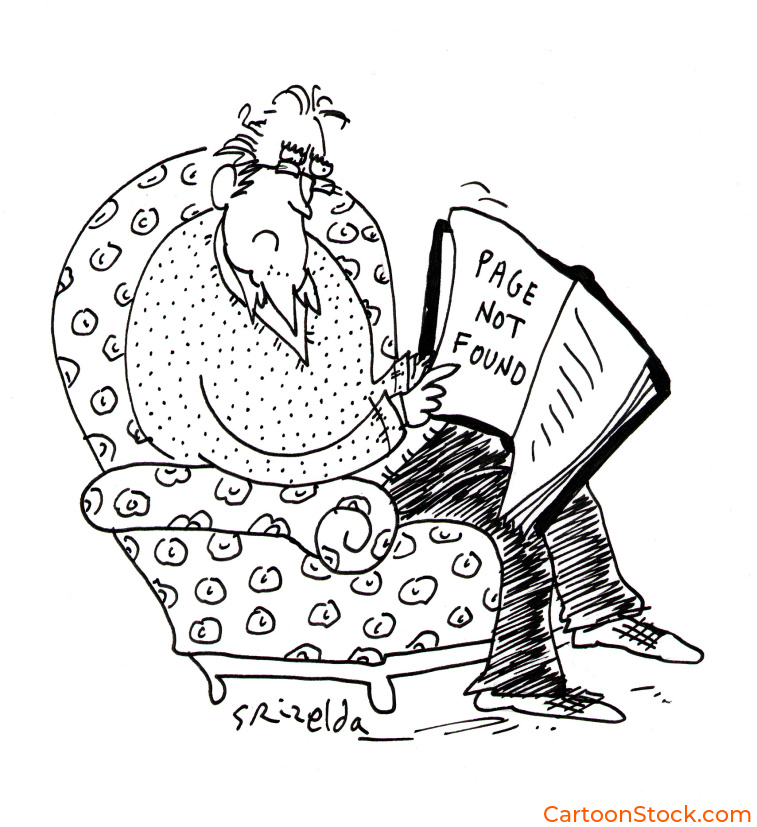
Error states and dead ends. Nobody wants to see “Error 404” or “No results found.” A cartoon that acknowledges the frustration with humor (“We looked everywhere!”) softens the blow and keeps users engaged instead of bouncing.
Each of these moments is a cognitive bottleneck. Cartoons don’t eliminate the complexity—they translate it into something the user’s brain can process without extra effort.
When Not to Use Cartoons (Yes, There Are Limits)
Cartoons are powerful, but they’re not universal. Knowing when to hold back is just as important as knowing when to deploy them. Authority in UX means showing restraint, not just enthusiasm.
Avoid cartoons in high-stakes, legal, or emergency situations. If users are reporting fraud, confirming a purchase, or dealing with account security, humor and whimsy undermine trust. In these moments, clarity and seriousness matter more than charm.
Don’t use cartoons if they add cognitive steps. If users have to stop and interpret the cartoon before understanding the message, you’ve made the problem worse. The cartoon should be instantly readable—not a puzzle in itself.
Skip the cartoon if humor overshadows instruction. Clever is good. Confusing is not. If users walk away remembering the joke but not the feature, the cartoon failed. The message always comes first.
The goal isn’t to cartoon everything. It’s to use them strategically in moments where visual communication genuinely reduces friction and builds understanding.
Keep Reading
Want to see how cartoons can compliment accessible cartoon UX?
Read: Accessible Cartoon UX: Designing Clear and Inclusive User Experiences
Q&A: Common Questions About Cartoons and Cognitive Load
Q: What is cognitive load in UX?
Cognitive load refers to the mental effort required to process information and complete tasks in a digital interface. High cognitive load leads to confusion, errors, and abandonment. Good UX design minimizes unnecessary mental strain.
Q: Are cartoons valid UX tools or too informal?
Cartoons are entirely valid when used strategically. They’re informal in tone, but that doesn’t make them unprofessional. In fact, they often increase comprehension and task completion—key UX metrics—by making complex information more accessible.
Q: How can cartoons reduce the time users spend understanding a feature?
Cartoons provide instant visual context that text alone can’t deliver as quickly. Instead of reading and interpreting instructions, users see a concrete example and “get it” immediately. That saves time and reduces friction.
Q: Are cartoons helpful for non-native English speakers in UX?
Absolutely. Visual communication transcends language barriers. A well-designed cartoon conveys meaning even when text is unclear or unfamiliar. This makes products more inclusive and accessible to global audiences.
Q: Can cartoons improve task completion rates?
Yes. By reducing ambiguity, lowering anxiety, and making instructions more memorable, cartoons help users move through flows with more confidence. When users understand what to do and why it matters, they’re far more likely to finish the task.