
Part of our UX Design with Cartoons guide
The Psychology of Frustration (And Why It Matters in UX)
Something went wrong. The page didn’t load. The payment failed. The search returned zero results. In these moments, users experience a spike of frustration, confusion, or disappointment. This is one of the most critical moments in your entire product experience, and most teams handle it poorly.
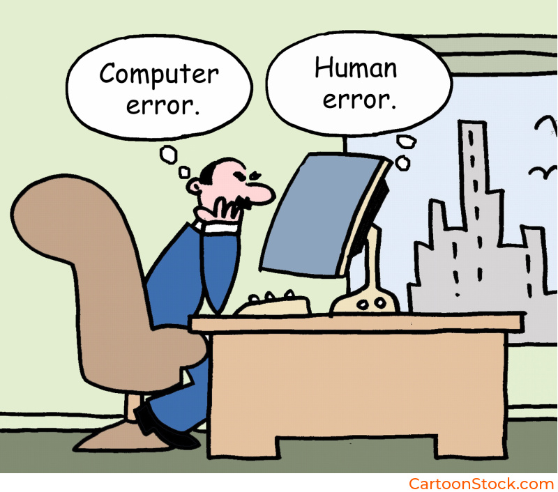
Traditional error messages are cold, technical, and often blame the user. “Invalid input.” “Error 404.” “No results found.” These messages do nothing to reduce tension or guide users toward a solution. They just confirm that something broke and leave users to figure out what happens next.
Error state cartoons UX changes this dynamic completely. A well-placed cartoon doesn’t eliminate the problem, but it does something more valuable: it softens the emotional blow and redirects attention toward the solution. Instead of feeling stuck or blamed, users see that the product understands their frustration and is here to help them move forward.
This isn’t about making light of problems. It’s about managing the psychological moment when users are most likely to abandon your product. Error state cartoons UX transforms high-friction interactions into opportunities for connection and recovery.
Why Cartoons Work So Well in Error States
Error states are emotional landmines. Users aren’t just confused, they’re often annoyed or anxious. Error state cartoons UX addresses both the practical and emotional needs of this moment.
They lower the emotional temperature. When users encounter a cartoon instead of a stark error message, their defensive reaction softens. The visual warmth signals that this isn’t a catastrophe. It’s a bump in the road, and the product is still on their side.
They model the correct behavior. A good error state cartoon shows what went wrong and hints at the solution. Instead of describing the problem in technical terms, you illustrate it. Users see the issue and understand what to do next without having to decode jargon.
They transform negative UX into approachable UX. Errors are inherently negative experiences. But error state cartoons UX can shift the tone from “you messed up” to “we’ll fix this together.” That subtle reframing keeps users engaged instead of driving them away.
They create memorable recovery moments. Users remember how a product made them feel when things went wrong. A clever, helpful cartoon during an error state builds goodwill. It turns a potential complaint into a story users share positively.
Enjoying this guide? Get more UX insights and free cartoons straight to your inbox.
The key is that error state cartoons UX doesn’t just decorate the problem. It actively helps users understand what happened and what to do about it.

Examples: Where Error State Cartoons Make the Biggest Difference
Let’s look at specific scenarios where cartoons turn frustrating moments into manageable ones.
“Page not found” screens. The classic 404 error is a dead end that usually just says “Oops.” A cartoon here can acknowledge the wrong turn with humor while directing users back to useful parts of your site. Show a character looking lost or searching through files. The visual tells users they’re not alone in this moment.
Failed payments. This is high-stakes frustration. Users want to complete a purchase, and something blocked them. Error state cartoons UX can soften this moment by showing a friendly character double-checking details or suggesting next steps. The cartoon keeps the interaction feeling human instead of transactional.
Empty dashboards. When users first log in and see nothing but blank space, it can feel discouraging. A cartoon in this empty state shows what the dashboard will look like once they add data or complete setup. It transforms emptiness into possibility.
Missing data or search results. “No results found” feels like a failure. A cartoon can reframe this as “We looked everywhere for you” and suggest alternative searches or actions. The visual keeps users engaged instead of bouncing.
No notifications yet. An empty inbox or notification center can feel lonely. Error state cartoons UX turns this into a lighthearted moment: “All caught up!” or “Nothing to see here… yet.” The cartoon validates that empty is sometimes good.
Each of these moments is a chance to either lose a user or keep them moving forward. Cartoons make forward momentum the natural choice.
How to Match Tone to Severity (Without Getting It Wrong)
This is where many teams struggle with error state cartoons UX. Not every error deserves the same treatment. The tone needs to match the severity of the situation, or you risk coming across as tone-deaf.
Low-severity errors: Go for light humor. Missing search results, empty states, or minor input mistakes are safe territory for playful cartoons. Users aren’t upset, just momentarily stuck. A clever visual helps them move on quickly.
Medium-severity errors: Be helpful and reassuring. Failed form submissions, connectivity issues, or temporary unavailability need cartoons that acknowledge frustration while guiding users to solutions. The tone should be friendly but not dismissive.
High-severity errors: Stay serious and clear. Payment failures, security warnings, account suspensions, or data loss are not the time for jokes. If you use a cartoon here at all, it should be minimal and purely functional. Focus on clarity and next steps, not charm.
The rule of thumb: if the user could lose money, access, or important data, skip the humor. Error state cartoons UX works best when the stakes are low to medium and when the visual genuinely helps users understand or recover.
Common Mistakes to Avoid
Even with good intentions, error state cartoons UX can backfire if you’re not careful. Here’s what to watch out for.
Making light of serious problems. If a user just lost their work or can’t access their account, a silly cartoon feels insulting. Always match the gravity of the situation. When in doubt, err on the side of being more serious.
Adding confusion instead of clarity. If users have to figure out what the cartoon means before they can solve the problem, you’ve made things worse. The cartoon should be instantly readable and directly related to the error at hand.
Using irrelevant humor. A random joke that has nothing to do with the error doesn’t help. The cartoon needs to be contextual. If users are searching for something and find no results, show a character searching. Don’t show a character on vacation.
Overdesigning the cartoon. In error states, simplicity matters. A cluttered or overly detailed cartoon can overwhelm users who are already frustrated. Keep it clean, clear, and quick to parse.
Forgetting the actionable next step. The cartoon draws attention, but the instruction gets users moving. Always pair error state cartoons UX with clear guidance on what users should do to resolve the issue.
When you avoid these pitfalls, cartoons become one of your most effective tools for managing user frustration and maintaining engagement during setbacks.
Keep Reading
Want to see how cartoons build trust and connection throughout your entire interface?
Read: Why Cartoons Make Digital Interfaces Feel More Human
Q&A: Common Questions About Cartoons in Error States
Q: Should error states be funny?
It depends on severity. Low-stakes errors like empty states or minor mistakes benefit from light humor. High-stakes errors like payment failures or security warnings should prioritize clarity over cleverness. The cartoon can still be friendly without being funny.
Q: Do cartoons reduce user frustration in error states?
Yes, when used appropriately. Error state cartoons UX lowers emotional temperature by adding warmth and visual clarity to frustrating moments. Users respond better to friendly guidance than cold technical messages.
Q: Are cartoons appropriate for financial or health apps?
They can be, but tone matters more in these contexts. Financial and health apps deal with sensitive information and high stakes. Cartoons here should be professional, clear, and never trivialize serious issues. Think illustration as functional guide, not joke. CartoonStock.com is a searchable database (the worlds largest!) of over 750,000 cartoons, so you’re guaranteed to find the perfect image to match your brands tone
Q: What makes an error state cartoon effective?
The best error state cartoons clearly show what went wrong, feel emotionally appropriate to the situation, and guide users toward the next action. They’re simple, contextual, and always paired with clear instructions.
Q: Can cartoons work in B2B error states?
Absolutely. B2B users are still humans who experience frustration. The difference is in execution. B2B error state cartoons tend to be more polished and less whimsical, but they still provide the same benefits: reduced tension and improved clarity.