
Why UI Needs Personality as Well as Clarity
Part of our full guide -> UI & Visual Design with Cartoons: Strategic Visual Identity, Interface Elements, and Design System Integration
Modern interfaces have never been cleaner. Design systems are more refined, icons more precise, and layouts more streamlined than ever before. But somewhere in all that optimization, something got lost: personality.
Icons handle function beautifully. They tell you where to click, what to expect, and how to navigate. But they don’t convey tone. They can’t tell you whether a moment is exciting, frustrating, or worth celebrating. That’s where cartoons come in.
Cartoons provide emotional context without disrupting the UI framework. They work alongside your carefully crafted icon system—not instead of it. Think of them as the voice that gives your interface character, while icons remain the signposts that keep users moving forward.
And no, cartoons in UI design aren’t trying to replace your icons. They’re just giving them a personality boost.
What Cartoons Communicate That UI Icons Can’t
Icons are fantastic at efficiency. A checkmark means success. A gear means settings. A house means home. But what about everything in between?
That’s where cartoons shine. They communicate emotional nuance that icons simply aren’t designed to express: relief, humor, frustration, excitement. They help users feel something at key moments in their journey—something that flat, functional symbols can’t quite manage.
Cartoons also clarify brand voice in human moments. When your onboarding flow says “Almost there!” alongside a cartoon character wiping their brow, users get it. The icon shows progress. The cartoon shows how you feel about progress.
Because cartoons can depict scenarios, they help bridge the gap between instruction and meaning. Instead of an abstract symbol, users see a relatable moment. It’s faster, friendlier, and more memorable.
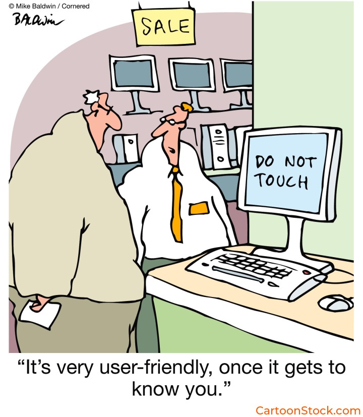
Many UX teams find it easier to use ready-made editorial cartoons from libraries like CartoonStock. These collections offer a huge range of emotion-led humor without requiring teams to commission new UI illustrations or redesign existing iconography.
Where Cartoons Work Best Alongside Icons
Not every screen needs a cartoon. But certain moments practically beg for one.
Onboarding sequences are prime real estate. The functional icon communicates the step (“Add your photo”), while a cartoon conveys the emotion behind it (a character proudly holding up a trophy photo). It turns instruction into encouragement.
Empty states often feel cold or clinical when served with icons alone. A folder icon says “No files yet.” A cartoon of someone relaxing with their feet up says “Nothing here yet—kick back while you upload.”
Feature announcements benefit too, especially when highlighting improvements or celebrating releases. An icon shows what changed. A cartoon shows why users should care.
And then there’s user education—contextual tips or lightweight tooltips where icons lack storytelling power. A lightbulb icon says “tip.” A cartoon character having an “aha!” moment says “this will make your life easier.”
How Cartoons Support Mascots & Avatars Without Replacing Them
If your brand already has a mascot or avatar system, you might wonder: do cartoons compete with that?
Not if used correctly. Mascots set identity. Cartoons add interpretive context.
Think of it this way: your mascot is your brand’s face. Cartoons are the situations your mascot encounters—or the emotional moments that surround your mascot’s world. They expand on the mascot’s emotional range without requiring you to alter the mascot artwork itself.
Cartoons provide humorous context around the mascot’s personality. They help craft a brand tone without requiring fully illustrated narrative flows. And because single-panel cartoons stand alone, they don’t disrupt the character system you’ve carefully built.
The mascot stays consistent. The cartoons bring variety.
Why Single-Panel Cartoons Work So Well Here
Single-panel cartoons are uniquely suited for UI work. Here’s why:
They convey a complete idea instantly. No narrative sequence needed. No scrolling through frames. One image, one insight, one laugh (or nod of recognition).
They avoid interfering with the design system’s visual hierarchy. Because they’re self-contained, they don’t pull focus from navigation, CTAs, or core functionality. They enhance without overwhelming.
They reduce the cost and effort of creating custom UI illustrations. Instead of commissioning bespoke artwork for every emotional touchpoint, teams can source cartoons that already match their product tone.
They add personality without adding interface noise. That’s the sweet spot for UI design: emotional impact with minimal visual clutter.
Many teams use a curated library—such as CartoonStock’s single-panel catalogue—to source cartoons that match their product tone without commissioning new artwork or redesigning system icons. With thousands of options tagged by emotion, topic, and scenario, it’s easier than starting from scratch.
When Not to Use Cartoons Next to Icons
Let’s be clear: cartoons aren’t appropriate everywhere.
Skip them for high-severity errors—especially in finance, medical, or security contexts. A locked-out bank account isn’t the time for humor. Neither is a failed medical upload or a security breach alert.
Avoid cartoons in legal or compliance instructions. Users need to focus on the content, not decode whether a cartoon is reinforcing or undermining the seriousness of the message.
In interfaces where neutrality is part of the trust model—like banking dashboards or enterprise admin panels—cartoons can feel out of place. Not wrong, necessarily. Just mismatched.
And finally, avoid situations where the cartoon could compete visually with the UI element’s meaning. If users have to decide whether to look at the icon or the cartoon, you’ve lost clarity. The two should work in harmony, not tension.
Keep Reading
Ready to choose the right visual style for your product?
Read: Choosing the Right Cartoon Style for Your Digital Product
Q&A: Cartoons, Icons, and UI Design
Are cartoons suitable for UI design?
Yes—when used alongside icons rather than replacing them. Cartoons add tone and clarity, especially at human moments in the user journey. They’re not functional signposts, but they make those signposts feel warmer and more relatable.
Do cartoons conflict with mascot or avatar systems?
Not if used correctly. Mascots set identity; cartoons add interpretive context. Think of mascots as your brand’s face and cartoons as the situations or emotions surrounding that face.
How can teams find cartoons that match their interface tone?
Many designers source humor-led visuals from curated cartoon libraries, such as CartoonStock.com These platforms offer thousands of single-panel options tagged by emotion, topic, and scenario—making it easy to find the right fit without commissioning custom work.
Are cartoons too informal for professional software?
Not when carefully chosen. Cartoons can help humanize UX without undermining professionalism. The key is matching tone: playful where appropriate, subtle where needed.
When shouldn’t cartoons appear near UI components?
Whenever clarity, legality, or severity outweigh emotional tone. If the moment requires focus, precision, or neutrality, leave the cartoon out.
Related Posts
- Best Practices for Using Cartoons in Design Systems
- Common Mistakes When Using Cartoons in UI (And How to Avoid Them)
- Dark Mode UI: Making Cartoons Work Across Interface Themes
 If you enjoyed this post, sign up and receive a hand-picked selection of great cartoons straight to your inbox every week!