
Why Dark Mode Creates Unique Challenges for Cartoons
Part of our full guide ->UI & Visual Design with Cartoons: Strategic Visual Identity, Interface Elements, and Design System Integration
Dark mode isn’t simply light mode inverted. It fundamentally changes contrast, tone, and readability. What works perfectly on a white background can completely disappear on black.
Cartoons—especially line-based single-panel ones—can lose clarity if not handled carefully. Thin black lines fade into dark backgrounds. Colors behave differently. Captions become harder to read. Even the emotional tone of humor shifts slightly when surrounded by darkness.
This creates a challenge for teams using cartoons dark mode UI design: how do you maintain personality without sacrificing legibility?
The good news? You don’t need to redesign your entire cartoon library. With a few thoughtful adjustments, cartoons can feel intentional and readable in both light and dark themes.
The Main Issues Cartoons Face in Dark Mode
Before we solve the problem, let’s understand it. Here’s what typically goes wrong when cartoons meet dark mode:
Low contrast. Thin black lines fade into dark backgrounds, making details hard to see. What was crisp becomes muddy.
Color distortion. Colors appear more saturated or muddy on dark backgrounds. A subtle palette in light mode can feel garish in dark mode.
Caption legibility. Text-heavy cartoons become hard to read, especially if the caption font is small or the contrast isn’t adjusted.
Emotional tone shifts. Humor genuinely feels different on dark backgrounds. It tends to read slightly more serious or subdued, which can undermine a lighthearted moment.
UI hierarchy conflict. Cartoons may overpower or clash with the UI’s focus elements, especially if they’re not properly contained or scaled.
Best Practices for Using Cartoons in Dark Mode UI
The fixes are simpler than you might think. Here’s what works:
Use a light container or background behind the cartoon. This is the simplest and most universal solution. A white or light gray rectangle behind the cartoon preserves the artwork’s original style without requiring modifications. It’s clean, consistent, and effective.
Avoid pure black backgrounds directly behind line-art cartoons. If you can’t use a light container, opt for dark grays, muted tones, or lightly textured surfaces. These improve clarity without breaking the dark mode aesthetic.
Control the scale. Slightly increase cartoon size in dark mode so lines remain readable. This prevents users from needing to zoom or squint to catch details. Even a ten to fifteen percent increase can make a significant difference.
Check caption clarity. Captions should remain sharp with enough contrast. Consider adding a subtle background tint or stroke if the caption is essential to understanding the cartoon. Caption-heavy cartoons require extra testing in dark mode—what’s readable in light mode might not translate.
How to Maintain Style Consistency Across Themes
Here’s the secret: cartoons don’t need versioning. You don’t need separate “light mode” and “dark mode” editions of every cartoon. The container approach resolves ninety percent of the differences.
Keep the cartoon’s palette untouched. Instead, adapt your UI frame around it. This maintains artistic integrity while solving the technical problem.
Ensure spacing remains consistent across themes to avoid visual “jumps” when users switch modes. The cartoon’s position, size, and padding should feel stable.
Avoid re-coloring cartoons to “fit” the theme. It risks breaking the cartoon’s original tone and clarity. More importantly, it creates version control headaches. Stick with the original artwork and adjust the environment around it.
Many teams simply select cartoons that already have strong line quality—something easy to filter for when browsing an editorial archive such as CartoonStock.com, where black-and-white line styles and contrast-friendly cartoons are plentiful in the worlds biggest online database.
When Cartoons Should Be Avoided in Dark Mode UI
Even with best practices, some situations call for skipping the cartoon entirely in dark mode. Here’s when:
Very dense interfaces with many interactive elements. Dark mode already reduces visual breathing room. Adding a cartoon can push it over the edge into chaos.
High-severity or urgency-oriented screens. Error states, security alerts, and critical warnings need full attention. Cartoons compete for that attention.
Places where maximal contrast is required for accessibility. If your interface is already fighting for readability, don’t add more elements to parse.
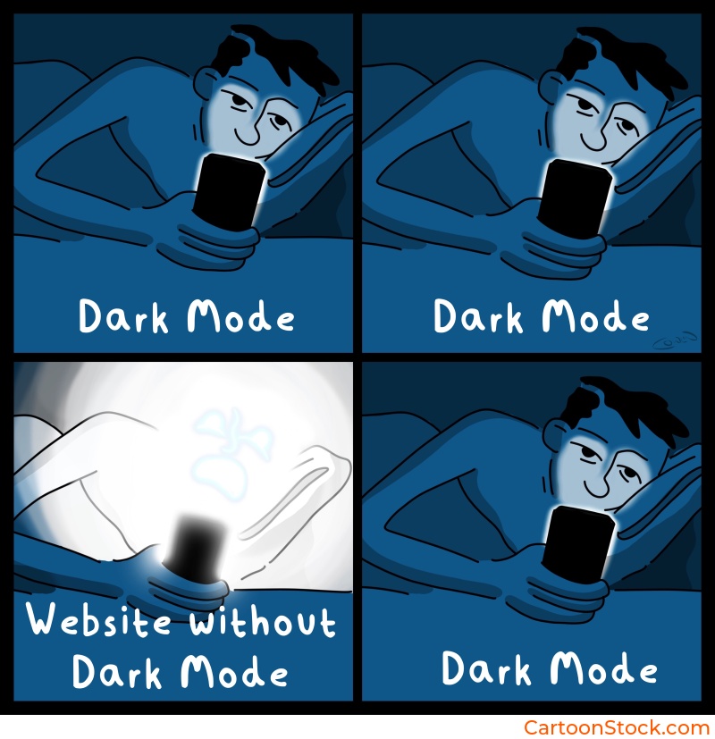
Moments when tone or humor could be misinterpreted in low-light or bedtime environments. This is common for mobile apps used at night. What feels playful during the day can feel jarring in a dark, quiet setting.
Ensuring Accessibility in Dark Mode
Accessibility doesn’t take a break when the lights go out. Here’s what to check:
Maintain WCAG contrast ratios between the cartoon and its background container. Just because it “looks okay” doesn’t mean it meets standards.
Keep captions at readable sizes. Avoid very small font sizes that might work in light mode but become illegible in dark mode.
Use alt text that explains the intent of the cartoon, especially for screen reader compatibility. Dark mode doesn’t change the need for inclusive design.
Avoid faint grays or low-opacity elements near the cartoon. They vanish in dark mode and create confusion.
Testing Cartoons Across Themes
Don’t guess. Test. Here’s how:
A/B test cartoon visibility and readability across modes. What works in one theme might fail in another.
Check user reactions. Some humor reads differently in dark mode environments. A cartoon that feels cheerful in light mode might feel flat in dark mode.
Test on OLED displays, where black is true black and can swallow detail. This is especially important for mobile products.
Keep Reading
Ready to avoid common pitfalls?
Read: Using Cartoons in UI design
Q&A: Cartoons in Dark Mode
Do cartoons work in dark mode UI?
Yes, as long as contrast and readability are maintained with thoughtful placement or background containers. The key is treating the cartoon as content that needs support, not decoration that can be dropped anywhere.
Do cartoons need an alternate dark mode version?
Usually not. A light container solves contrast issues without altering the artwork. Creating separate versions adds complexity without much benefit.
What types of cartoons work best in dark mode?
Strong line-art cartoons with clear shapes. These maintain clarity even when contrast is reduced. Designers often search for these qualities in cartoon libraries like CartoonStock.
Can humor feel different in dark mode?
Yes. Dark backgrounds change the emotional tone slightly, making humor feel more subdued. Subtle or dry humor tends to work better than loud, chaotic visuals in dark environments.
How do I test if a cartoon works well?
Check it on multiple screens, in both themes, and measure whether users interpret the humor or message correctly. If comprehension drops in dark mode, the cartoon needs adjustment or replacement.
Related Posts
- Common Mistakes When Using Cartoons in UI (And How to Avoid Them)
- Choosing the Right Cartoon Style for Your Digital Product
- Best Practices for Using Cartoons in Design Systems
 If you enjoyed this post, sign up and receive a hand-picked selection of great cartoons straight to your inbox every week!