
Part of our UX Design with Cartoons guide
Why Accessibility Applies to Cartoons Too
When teams think about accessibility in UX, they usually focus on color contrast, keyboard navigation, and screen reader compatibility. These are critical, but there’s a piece that often gets overlooked: visual content itself. And that includes cartoons.
Accessible cartoon UX means designing illustrations that work for the widest possible range of users. This includes people with visual impairments, cognitive differences, language barriers, and cultural backgrounds different from your own. It’s about making sure that when you use a cartoon to communicate something important, everyone can actually understand it.
This isn’t just about compliance or checking boxes. It’s about building products that genuinely serve all users, not just the ones who match your design assumptions. When you prioritize accessible cartoon UX, you create interfaces that are clearer, more usable, and more welcoming for everyone.
The good news? Many of the principles that make cartoons accessible also make them more effective overall. Clarity benefits all users. So does thoughtful design. Accessible cartoon UX isn’t a separate consideration. It’s part of creating excellent UX, period.
Design Considerations for Accessible Cartoon UX
Let’s break down the specific elements that determine whether your cartoons are truly accessible. These aren’t theoretical concerns. They’re practical design decisions that affect real users every day.
Legibility matters more than style. Complex line work, tiny details, or overly stylized illustrations can be beautiful, but they’re often hard to interpret quickly. Accessible cartoon UX prioritizes clear, bold lines and simple compositions that read well even at smaller sizes or lower resolutions.
Cultural sensitivity isn’t optional. Humor and visual references don’t translate universally. A cartoon that feels friendly in one culture might confuse or offend in another. Accessible cartoon UX considers whether the scenario, humor, and visual metaphors make sense across different backgrounds.
Color contrast affects everyone. Users with low vision or color blindness struggle with cartoons that rely on subtle color differences to convey meaning. Accessible cartoon UX ensures strong contrast between elements and never uses color as the only way to communicate information.
Caption clarity bridges gaps. The text in or around your cartoon should be concise and straightforward. Avoid jargon, idioms, or wordplay that doesn’t translate well. Accessible cartoon UX pairs visuals with language that supports comprehension, not complicates it.
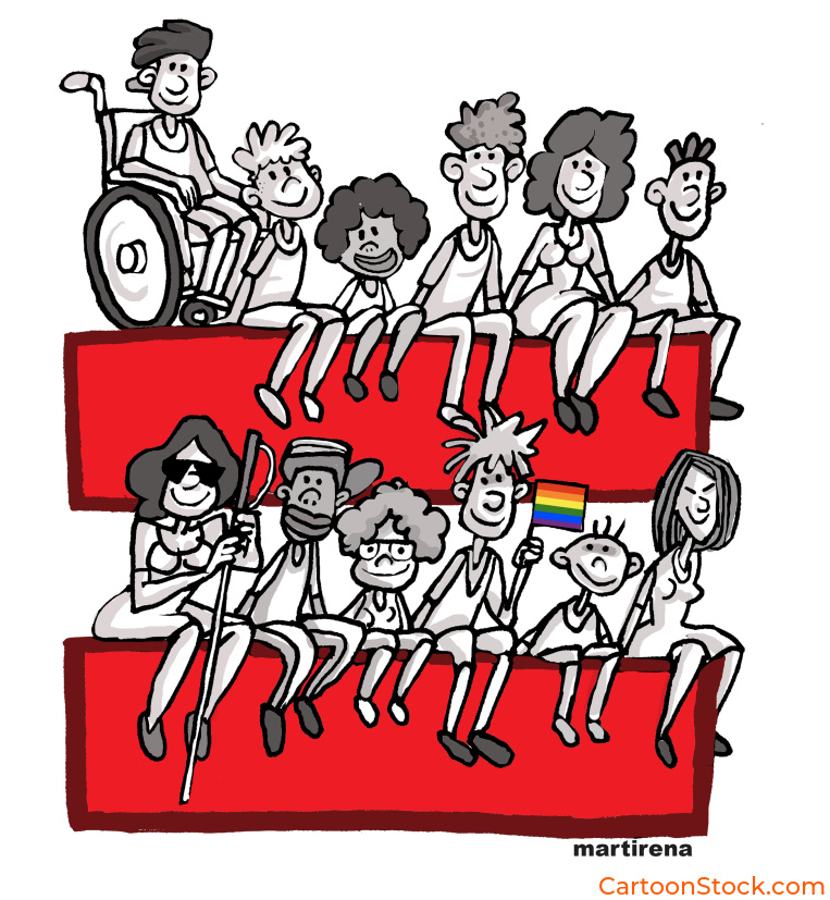
Avoiding stereotypes protects dignity. Cartoons have a long, unfortunate history of using visual stereotypes. Accessible cartoon UX actively rejects outdated representations based on gender, race, age, ability, or profession. The goal is to depict situations and emotions, not reinforce harmful assumptions.
Each of these considerations shapes whether your cartoons genuinely support all users or accidentally exclude some. Accessible cartoon UX takes these elements seriously from the start, not as an afterthought.
How Cartoons Support Inclusive UX
When done right, accessible cartoon UX doesn’t just avoid barriers. It actively creates opportunities for better understanding across diverse user groups.
Cartoons support multilingual users. Visual communication transcends language in ways that text never can. A well-designed cartoon conveys context, emotion, and action without requiring fluency in the interface language. This makes accessible cartoon UX especially valuable for global products serving users with varying English proficiency.
They explain complex ideas without jargon. Not everyone has the same technical vocabulary or domain knowledge. Cartoons can illustrate concepts that would take paragraphs to explain in text. Accessible cartoon UX helps level the playing field by making information visual and immediately graspable.
They help neurodivergent users interpret intent. Some users struggle with abstract language, implied meaning, or social cues in text. A cartoon that shows the scenario directly removes ambiguity. Accessible cartoon UX makes communication more literal and concrete, which benefits users with autism, ADHD, dyslexia, and other cognitive differences.
They create emotional safety. For users with anxiety or who find dense interfaces overwhelming, cartoons provide visual breathing room. They signal where to focus attention and reduce the cognitive load of parsing complex instructions. Accessible cartoon UX acknowledges that clarity and warmth aren’t luxuries. They’re accessibility features.
They accommodate different learning styles. Some people process visual information faster than text. Others need both to fully understand. Accessible cartoon UX provides multiple pathways to comprehension, which means more users succeed on their first attempt.
The power of accessible cartoon UX is that it doesn’t just help users with specific disabilities. It makes the entire interface more usable for everyone.

Technical Accessibility: Making Cartoons Work with Assistive Technology
Accessible cartoon UX isn’t just about visual design. It’s also about how your cartoons interact with the technology that users rely on.
Alt text is non-negotiable. Every cartoon needs descriptive alt text that conveys what the image shows and why it matters in context. “Cartoon of people collaborating” isn’t enough. “Illustration showing two people reviewing documents together, representing the team collaboration feature” gives screen reader users the full picture.
Context matters more than decoration. If a cartoon is purely decorative and adds no functional information, mark it as such for screen readers. But if the cartoon conveys meaning, supports a task, or clarifies instructions, the alt text needs to communicate that value clearly.
Don’t rely on cartoons alone. Accessible cartoon UX always pairs visuals with text. The cartoon enhances understanding, but users should never need the image to complete a task or understand critical information. This redundancy ensures that everyone gets the message, regardless of how they access your interface.
Test with real users. The only way to know if your accessible cartoon UX actually works is to test it with people who use assistive technology, people from different cultural backgrounds, and people with various cognitive differences. Their feedback will reveal gaps you didn’t anticipate.
Technical accessibility and visual accessibility work together. Neither is complete without the other.
Common Mistakes That Undermine Accessible Cartoon UX
Even with good intentions, teams often make choices that reduce accessibility. Here’s what to watch out for.
Overly detailed illustrations. When cartoons contain too much visual information, they become cluttered and hard to parse. Users with cognitive differences or visual impairments especially struggle with busy compositions. Accessible cartoon UX keeps illustrations focused on a single clear idea.
Humor that excludes or confuses. Inside jokes, cultural references, or wordplay that requires specific knowledge create barriers. If users have to “get” something beyond the obvious visual, you’ve lost accessibility. The best accessible cartoon UX uses universal situations and emotions.
Low-contrast line styles or backgrounds. Thin lines, pastel colors, or cartoons placed over busy backgrounds reduce visibility for many users. Accessible cartoon UX maintains strong contrast and clean presentation so the illustration stands out clearly.
Assuming universal understanding. What seems obvious to your team might not be obvious to users from different backgrounds or with different abilities. Accessible cartoon UX questions assumptions and tests whether the meaning actually comes across as intended.
Forgetting about mobile and small screens. Cartoons that work beautifully on desktop can become illegible on phones. Accessible cartoon UX considers how illustrations scale and whether they remain clear across all device sizes.
Each of these mistakes reduces the number of users who can benefit from your cartoons. Accessible cartoon UX avoids them by prioritizing clarity and inclusion at every step.
Keep Reading
Want to see how cartoons transform frustrating moments into manageable ones?
Read: Using Cartoons in Error States, Warnings & Empty States
Q&A: Common Questions About Accessible Cartoon UX
Q: Are cartoons inherently accessible or do they create barriers?
Cartoons can be either, depending on execution. Well-designed accessible cartoon UX with clear visuals, good contrast, proper alt text, and cultural sensitivity improves accessibility. Cartoonstock.com has over 750,000 cartoons to choose from, so you’re guaranteed to find one that suits your needs!
Q: Can cartoons help neurodivergent users understand interfaces better?
Yes. Many neurodivergent users benefit from visual communication that makes abstract concepts concrete. Accessible cartoon UX reduces ambiguity and provides clear visual context that supports comprehension for users with autism, ADHD, dyslexia, and other cognitive differences.
Q: Do cartoons work with screen readers?
They can, when properly implemented. Cartoons need descriptive alt text that conveys both what the image shows and why it matters in context. Accessible cartoon UX always includes this information so screen reader users aren’t excluded from the visual communication.
Q: What makes a cartoon culturally inclusive?
Accessible cartoon UX avoids stereotypes, uses universal scenarios rather than culture-specific references, and depicts diverse people and situations. The humor and visual metaphors should be understandable across different backgrounds, not just to one specific audience.
Q: Should cartoons replace text for accessibility?
Never. Accessible cartoon UX uses cartoons to enhance and support text, not replace it. Some users need the visual, some need the text, and many benefit from both. Redundancy across multiple formats is what makes content truly accessible.
Q: How do you test if your cartoons are accessible?
Test with diverse users who represent different abilities, backgrounds, and assistive technology needs. Check color contrast ratios, verify alt text accuracy, and confirm that the cartoon’s meaning comes through clearly without requiring specific cultural knowledge or visual acuity.