
Why UI Design Needs More Than Just Function
Modern user interfaces are cleaner, faster, and more intuitive than ever. Design systems have matured. Icons are precise. Navigation is predictable. Everything works.
However, somewhere in all that polish, something important got lost: personality.
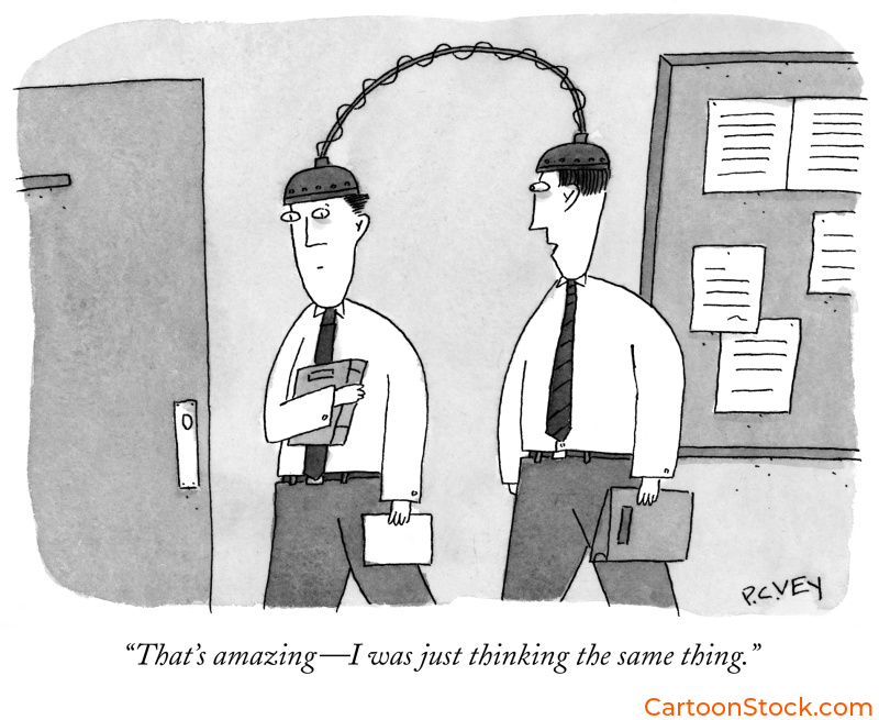
Users don’t just want interfaces that work. Instead, they want interfaces that feel human. While icons handle the “what,” cartoons handle the “how it feels.”
This guide shows you how to use cartoons in UI design strategically—not as decoration, but as intentional tonal elements that strengthen your visual identity, clarify interface moments, and integrate smoothly into design systems.
The Role of Cartoons in Modern Interface Design
First, let’s clear something up: cartoons aren’t trying to replace your UI components. They’re not icons. And they’re not mascots (though they work beautifully alongside them).
Instead, cartoons provide emotional context that functional UI elements can’t. For example, a checkmark tells users a task is complete. Meanwhile, a cartoon of someone wiping their brow in relief tells them how you want them to feel about that completion.
Specifically, they humanize moments where interfaces feel cold—empty states, error messages, waiting screens. Additionally, they reinforce brand voice at key touchpoints. Furthermore, they reduce cognitive load through visual shorthand.
Ultimately, the key is using cartoons alongside your UI framework, not inside it.
Understanding the Relationship Between Cartoons, Icons, and Mascots
Here’s the hierarchy:
Icons communicate function. Essentially, they’re wayfinding tools that tell users where to click and what to expect.
Mascots establish identity. Consequently, they’re the face of your brand, appearing in marketing, onboarding, and key brand moments.
Cartoons provide context and tone. In particular, they appear when emotional nuance matters—when you need to acknowledge feelings, celebrate milestones, or soften frustrating moments.
Importantly, these three elements work together. Your icon shows the action. Your mascot provides brand continuity. Meanwhile, your cartoon adds the emotional layer that makes the moment feel human. Understanding how cartoons complement icons, avatars, and mascots in UI design helps teams avoid treating them as interchangeable when they actually serve distinct purposes.
Choosing the Right Cartoon Style for Your Product
Clearly, style isn’t about aesthetics alone. Rather, it’s about alignment.
Consider your brand voice. For instance, playful brands can use looser, energetic styles. In contrast, professional tools benefit from cleaner lines and understated humor.
Think about your audience. Similarly, consumer apps can lean into friendly, accessible styles. On the other hand, enterprise SaaS needs sophistication—dry wit with clarity.
Match your UI’s visual language. Specifically, minimal interfaces need clean line-art cartoons. Conversely, colorful UIs may need monochrome cartoons to avoid visual competition.
Account for cognitive load. Simply put, simpler styles reduce visual effort. Therefore, dense interfaces need minimal cartoon detail.
Many teams explore options by browsing curated libraries like CartoonStock.com, where cartoons are organized by style, tone, and complexity. For deeper guidance on this critical decision, see our post on choosing the right cartoon style for your digital product.
Best Practices for Integrating Cartoons Into Design Systems
Obviously, design systems need consistency. Likewise, cartoons need the same guardrails.
Establish style and tone rules. First, define acceptable line weights, humor levels, and detail complexity. Then, create a “humor ceiling” that sets boundaries.
Set clear placement guidelines. For example, cartoons work in onboarding, empty states, user education, and feedback moments. However, they don’t belong in security checkpoints, payment flows, or legal disclosures.
Maintain visual hierarchy. Specifically, keep cartoons visually secondary—smaller, lighter, or offset. Generally, one per screen is usually sufficient.
Create a shortlist of approved styles. Moreover, curate a collection that represents your tonal range to prevent style inconsistency.
Test like any other UI element. Additionally, check accessibility, comprehension, and tone alignment. When possible, A/B test.
In essence, think of cartoons as editorial content within your design system, not interface components. For a comprehensive implementation framework, read our guide to best practices for using cartoons in design systems.
Making Cartoons Work Across Interface Themes
Undoubtedly, dark mode creates unique challenges for line-based cartoons that rely on contrast.
The problem: Thin black lines fade into dark backgrounds. Furthermore, colors behave differently. Even emotional tone shifts slightly in dark environments.
The solution: Simply use a light container behind the cartoon. As a result, this preserves the original style without requiring alternate versions.
Additional tips: First, slightly increase cartoon size in dark mode for readability. Second, avoid pure black backgrounds—dark grays work better. Finally, test on OLED displays where true black can swallow detail.
For specific techniques, explore our post on making cartoons work in dark mode UI.
Common Mistakes to Avoid
Treating cartoons like icons. Remember, icons convey function while cartoons convey tone. Therefore, keep cartoons adjacent to UI elements, not embedded within them.
Mixing too many styles. Clearly, different line weights and humor types create chaos. Instead, choose one or two styles and stick to them.
Using cartoons in high-stakes flows. For instance, security, payments, medical decisions—humor feels inappropriate here.
Overly complex cartoons. Inevitably, detailed cartoons distract from navigation and calls to action.
Placing cartoons too close to core elements. Rather, position near explanatory text or empty states, not inside primary action flows.
Not testing across themes. Unfortunately, line-art fades in dark mode. Therefore, test early and often.
Using cartoons too frequently. Generally speaking, one per screen, at key emotional moments, is usually enough.
For a complete breakdown with specific fixes, see our article on common mistakes when using cartoons in UI and how to avoid them.
Practical Implementation: Where to Start
Define your goals. First, be specific about what you’re trying to achieve.
Establish style boundaries. Next, create guidelines before selecting cartoons.
Test in low-risk contexts first. Initially, start with onboarding or empty states.
Build a small library. Then, curate a collection that reflects your tonal range.
Document everything. Subsequently, add guidelines to your design system.
Test across themes and devices. Additionally, verify cartoons work everywhere.
Iterate based on feedback. Finally, adjust if comprehension drops or engagement doesn’t improve.
Ultimately, the goal is intentional, strategic use of cartoons that makes your product feel more human without sacrificing usability.
Q&A: Cartoons in UI Design
Are cartoons appropriate for professional products?
Yes—when chosen carefully. In fact, professional doesn’t mean humorless. Clean lines, dry humor, and minimal visual noise work well in serious tools.
How do cartoons improve user experience?
Essentially, they add emotional context that functional UI elements can’t provide. They humanize cold moments, reinforce brand voice, and reduce cognitive load.
Do cartoons need to match UI icon style?
No. Actually, icons communicate function while cartoons communicate tone. They serve different purposes and can differ visually.
Where can teams find cartoons that fit their product tone?
Typically, many designers source cartoons from curated libraries like CartoonStock.com, the world’s largest database for cartoons
How many cartoons should appear in a UI?
Usually, one per screen or key moment. Otherwise, overuse dilutes impact and creates visual noise.
Can cartoons work in dark mode?
Yes, with proper contrast management. Simply use light containers behind cartoons and test across themes early.
What’s the biggest mistake teams make with cartoons in UI?
Namely, treating cartoons like functional UI components instead of tonal assets. Understanding this distinction prevents most problems.
Related Posts
The History & Art of Cartoons: A Visual Language Through Time
The Complete Guide to Editorial Cartoons in Publishing
The Psychology of Humor in Cartoons
