
Why Visual Communication Defines Modern User Experience
Digital products compete on experience, not just features. Users abandon interfaces that confuse them, frustrate them, or feel impersonal. They gravitate toward products that communicate clearly, respond warmly, and make complex tasks feel manageable. This is where cartoons in UX design become strategic tools rather than decorative elements.
A well-placed illustration can replace paragraphs of explanation. It can transform a frustrating error into a manageable moment. It can make an intimidating interface feel approachable. The psychology behind this is straightforward: your brain processes visual information faster than text. When you combine images with words, comprehension increases and retention improves. Add an emotional component like humor or empathy, and that information becomes memorable.
This isn’t about making products cute or casual. It’s about making them effective. Whether you’re onboarding new users, explaining complex features, or recovering from errors, strategic visual communication consistently outperforms text-only approaches.
 If you enjoyed this post, sign up and receive a hand-picked selection of great cartoons straight to your inbox every week! Subscribe today!
Reducing Cognitive Load: Making Complex Information Instantly Clear
Every interface asks users to process information, make decisions, and complete tasks. That mental work adds up quickly, creating what psychologists call cognitive load. When that load becomes too heavy, users abandon tasks, misinterpret features, or simply leave. Cartoons in UX design address this problem by turning abstract concepts into concrete visual moments.
Dual coding theory shows that when information is presented both visually and textually, people understand and remember it better. Your brain processes words and images through different channels. When both channels are active simultaneously, they reinforce each other. This matters most in moments of high complexity: account setup flows, feature comparisons, dashboard interfaces, and form explanations.
However, cartoons can also add cognitive load if used poorly. Overly complex illustrations or visuals that require interpretation create more work, not less. The key is strategic placement at genuine friction points, paired with clear captions that support understanding.
Explore the science and practical applications: How Cartoons Improve UX Clarity & Reduce Cognitive Load
First Impressions and Ongoing Guidance: The User Journey
The moment a new user first opens your product determines whether they’ll invest time in learning it or abandon it for something easier. Traditional onboarding relies on tooltips and tutorial slides that most users skip. Cartoons in UX design offer a better approach: showing instead of telling, welcoming instead of lecturing, and building momentum instead of creating friction.
During onboarding, a cartoon can clarify what the product does and what happens next, all without interrupting exploration. It reduces intimidation and creates positive emotional associations from the beginning. Beyond onboarding, cartoons guide users through ongoing experiences at key touchpoints: empty states, feature announcements, and milestone celebrations.
The pattern is consistent across successful implementations: cartoons work best when they anticipate confusion, acknowledge emotion, and point toward the next action. This ongoing visual guidance compounds into familiarity, confidence, and sustained engagement.
See how to optimize every stage of the journey: How Cartoons Enhance User Onboarding & First-Time Experiences
Turning Setbacks Into Recovery: Error States and Empty Experiences
Something went wrong. The page didn’t load. The payment failed. The search returned nothing. These moments trigger frustration and the impulse to leave. Traditional error messages are cold and technical. They confirm the problem but offer no emotional support or clear path forward. Cartoons in UX design transform these high-friction interactions into opportunities for connection and recovery.
When users encounter a cartoon instead of a stark error message, their defensive reaction softens. A well-designed illustration can acknowledge frustration, show what went wrong visually, and direct attention toward the solution. Users remember how a product made them feel when things went wrong more vividly than when everything worked smoothly.
However, tone matching is critical. Low-stakes errors like empty states are safe territory for light humor. High-stakes situations like payment failures need seriousness and clarity. The cartoon must reflect the gravity of the moment, or you risk appearing tone-deaf to legitimate concerns.
Master the art of visual recovery: Using Cartoons in Error States, Warnings & Empty States
Building Emotional Connection and Ensuring Universal Access
Most digital interfaces feel transactional. Users complete tasks in environments that are efficient but impersonal. Cartoons in UX design bridge this emotional gap by reflecting feelings back to users, softening functional moments with personality, and making products feel built by humans, for humans. Users who feel positively toward a product are more forgiving of bugs, more willing to explore features, and far more likely to recommend it.
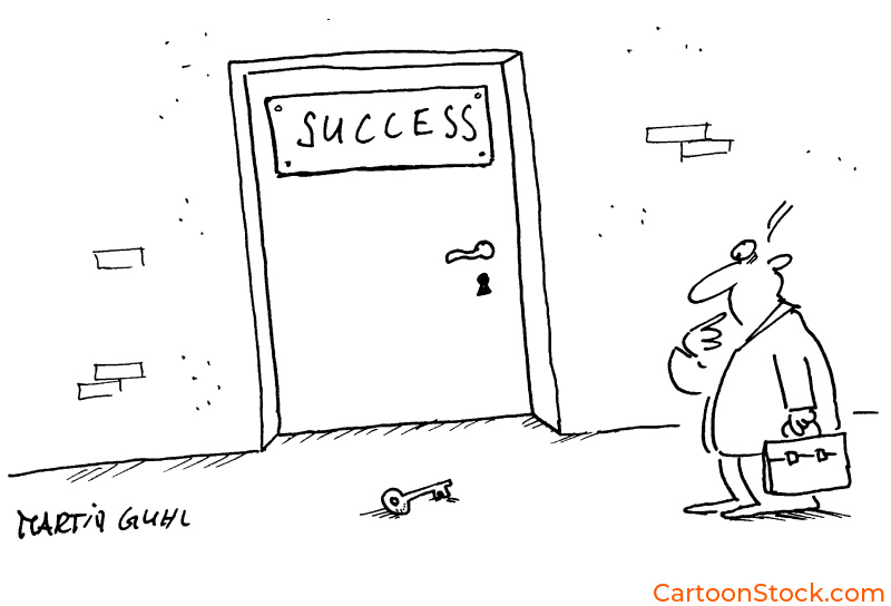
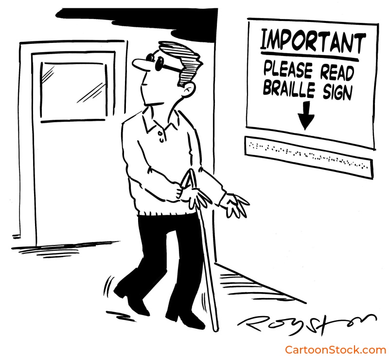
However, emotional connection only matters if the experience is accessible to everyone. Cartoons must work across languages, abilities, and cultural backgrounds. This means strong color contrast for users with visual impairments, clear compositions for those with cognitive differences, and universal scenarios that don’t rely on culture-specific references. Every cartoon needs descriptive alt text so screen reader users aren’t excluded.
The intersection of emotional design and accessibility creates interfaces that feel human while being functionally usable by the widest possible audience. Cartoons in UX design that prioritize both warmth and inclusion don’t just serve more users—they serve them better.
Discover how to design for everyone: Why Cartoons Make Digital Interfaces Feel More Human and Accessibility & Inclusive UX Design with Cartoons
Q&A: Common Questions About Cartoons in UX Design
Q: When should you use cartoons in UX design vs. other visual elements?
Cartoons work best when you need to convey emotion, simplify complexity, or create memorable moments. Use them for onboarding, error states, empty states, and feature explanations. For data visualization or precise technical diagrams, other visual formats may be more appropriate.
Q: Do cartoons make products look less professional?
Not when used strategically. Products like Slack, Mailchimp, and Duolingo use cartoons extensively while maintaining professional credibility. The key is matching tone to context and audience expectations.
Q: How do you ensure cartoons are culturally appropriate for global audiences?
Focus on universal scenarios and emotions rather than culture-specific references. Avoid idioms, region-specific humor, or imagery that doesn’t translate across cultures. Test with diverse user groups when possible.
Q: Can cartoons actually improve conversion rates and engagement metrics?
When implemented thoughtfully, yes. Cartoons can reduce abandonment in error states, increase onboarding completion, and improve feature adoption by making complex actions feel more approachable.
Q: What’s the difference between decorative and functional cartoons in UX?
Functional cartoons communicate information, guide behavior, or reduce friction. Decorative cartoons add visual interest but don’t serve a specific UX purpose. Prioritize functional cartoons for the strongest impact.